GPT-4o Changes Data Analysis

ChatGPT affects many different areas, but do you wonder which area is most affected? Of course, my answer is Data Science. In this article we will explore how it has completely changed data analysis. Using GPT-4, ChatGPT’s newest and brightest model, you can see how we can automate data analysis methods. Let’s start! NVIDIA is really popular right now, so let’s use the NVIDIA Stock Prices dataset from here. After downloading this dataset, you can upload it to your Google Drive and load it from there to ChatGPT, but uploading by drag and drop is easier.
NVIDIA Stock Prices
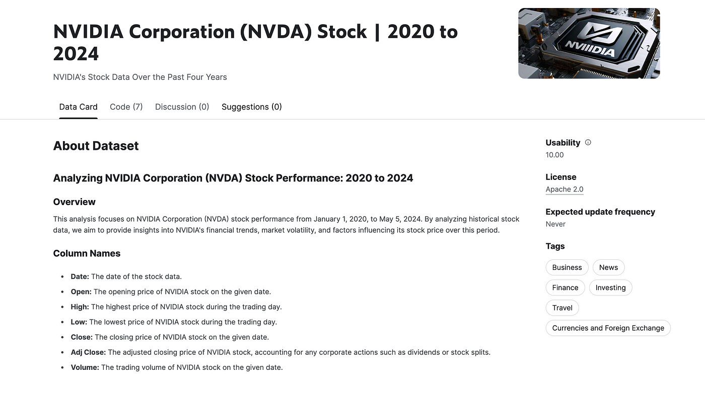
Data Exploration
Now let’s explore this dataset. To do that you can use following prompts;
- Show head and tail of this dataset.
- Show sample of this data randomly(10).
- What is the shape of this data?
- What are the data types of the column?
- Give me statistical information of the columns.(describe)
Now let’s apply them. Here is the first prompt.
Show head and tail of this dataset.
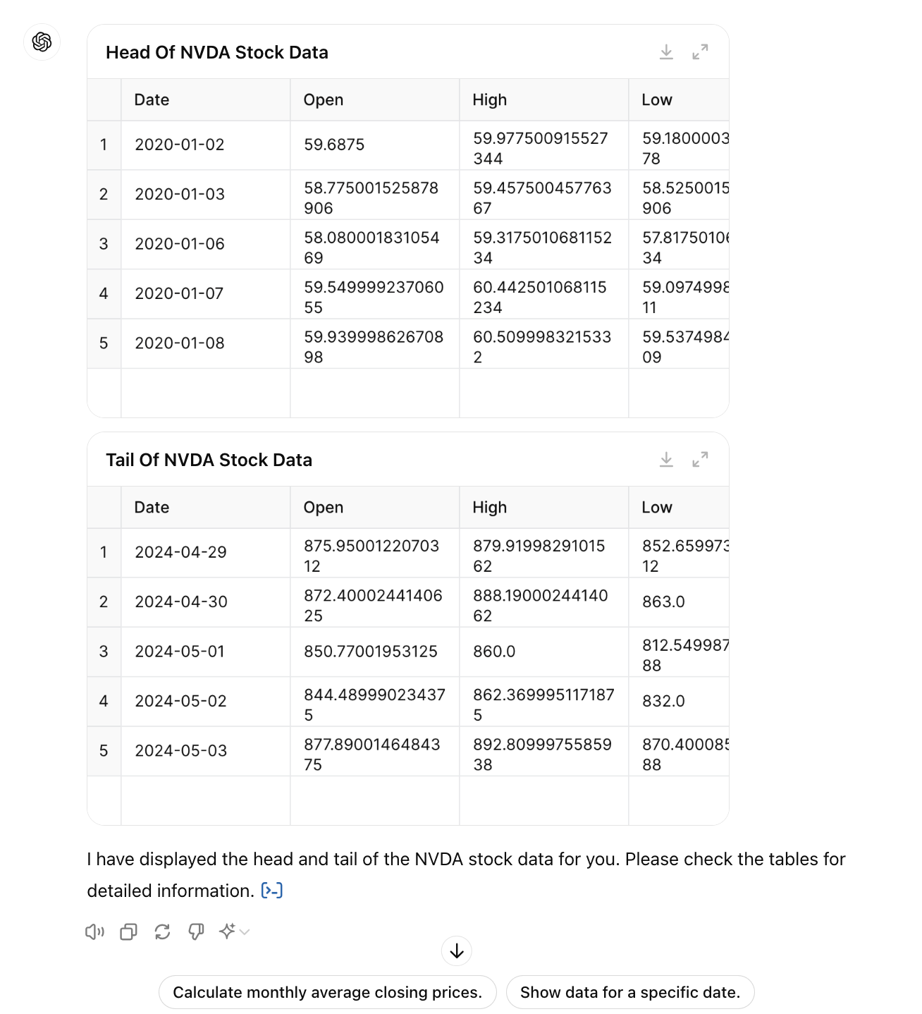
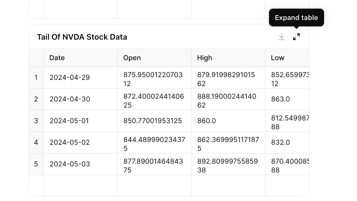
Also, you can expand these tables when you click on the expand button on the top right.
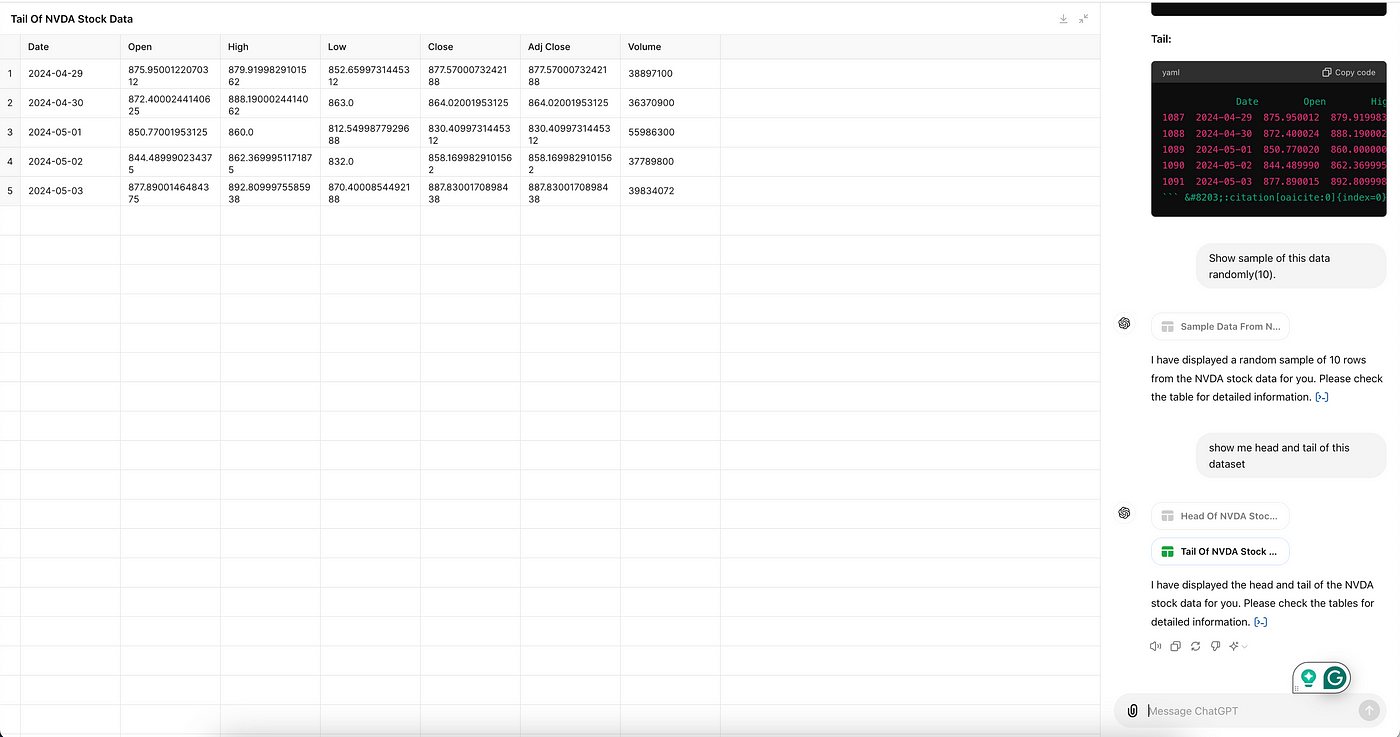
Once you click on this, the table expands like this, and you can still see the rest of the conversation right, as you can see below.
Let’s use our second prompt.
Show sample of this data randomly(10).
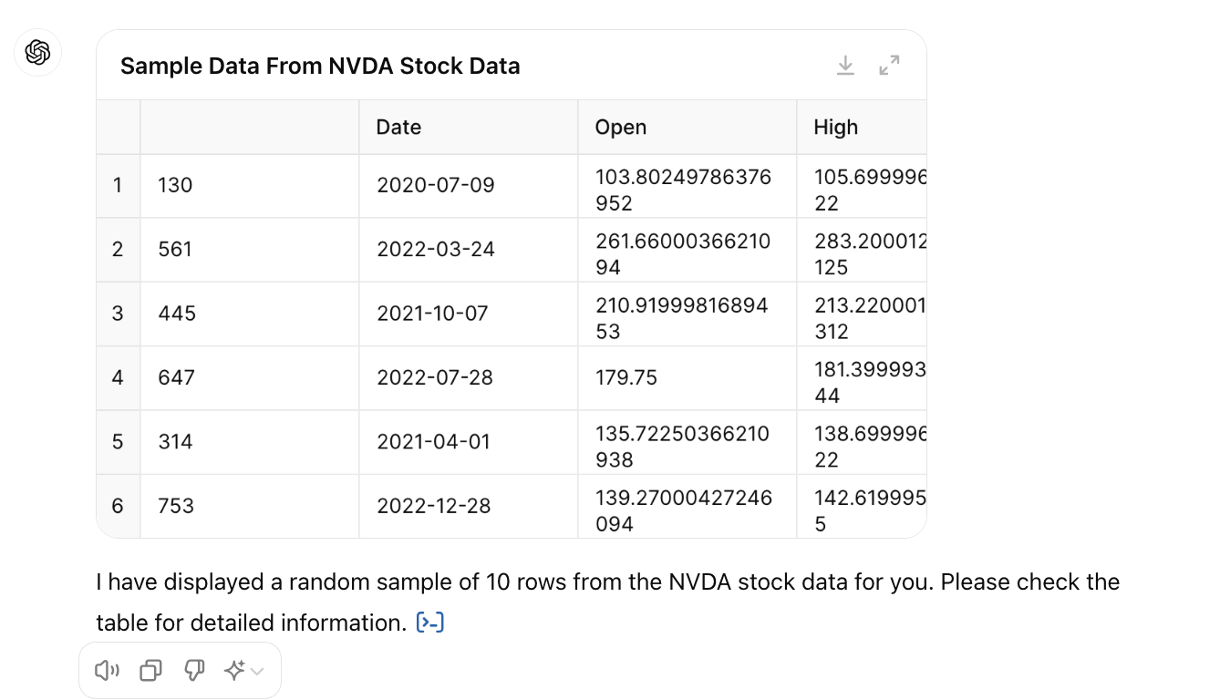
Let’s use another prompt.
Give me statistical information of the columns.(describe)
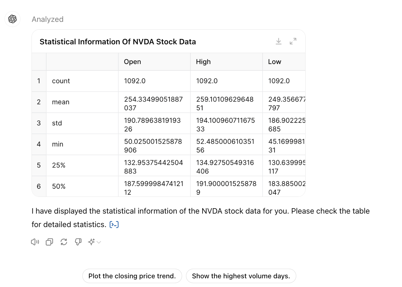
Did you notice something? Yes, the GPT-4o already suggest me an option to visualize this dataset, so no need to wait, right? Let’s continue with Data Visualization, here we have more surprises.
Data Visualization
Let’s see how we can automate data visualization too.
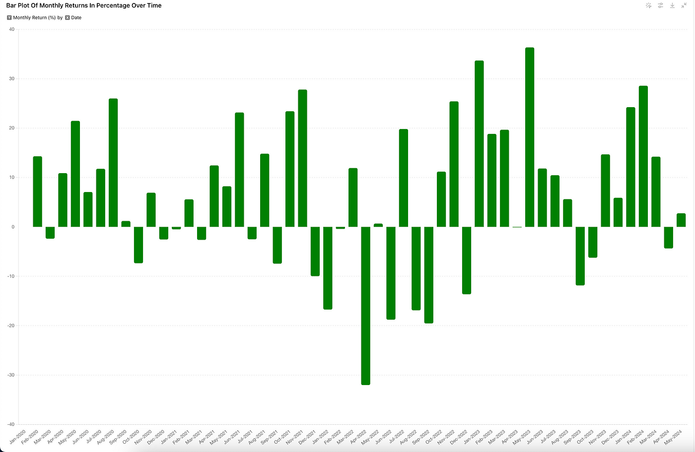
Bar Plot of Monthly Returns
If you buy stock in the start of the month and sell it at the end of the month, how much you will earn?
Let’s see the prompt;
Provide this: Bar Plot of Monthly Returns in percentage Daily over time,
date column should include this Month- Year instead of dates day by day.
Here is the output.
You can change the column by clicking on the second button on the top right, and here, you can easily adjust the plot.
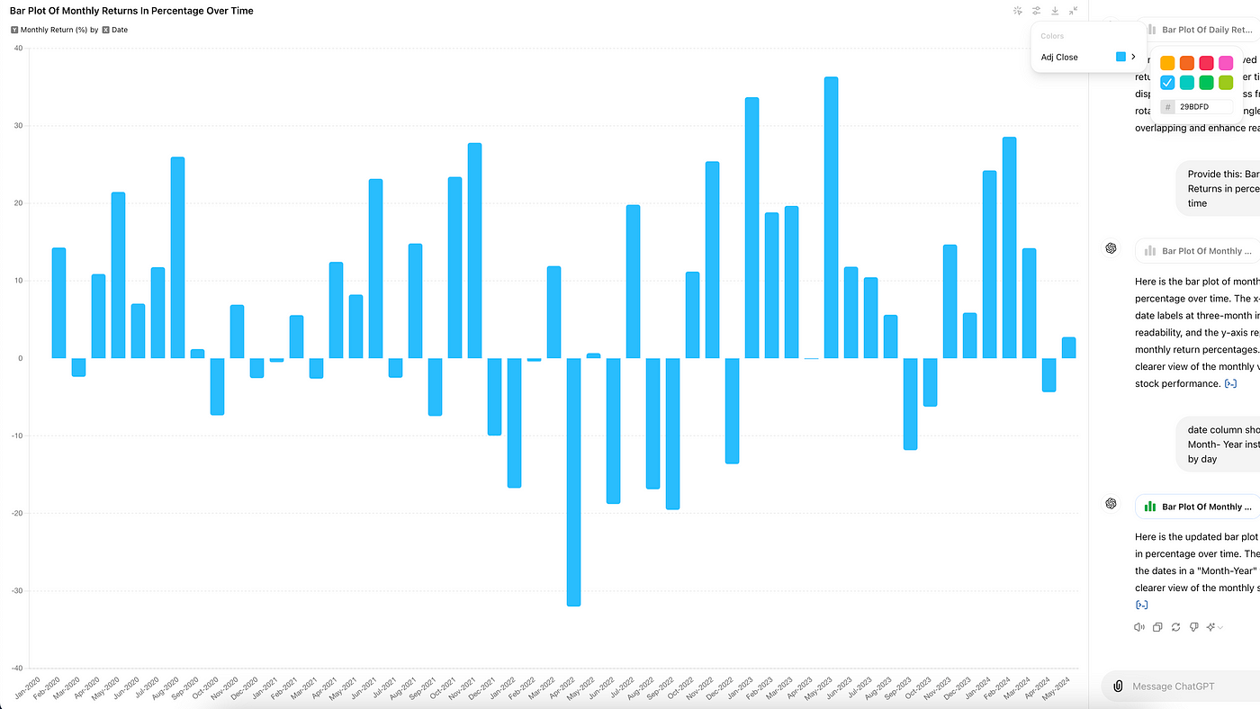
Also, when you click on the first button on the top right-switch to static chart, you can not change the plot now.
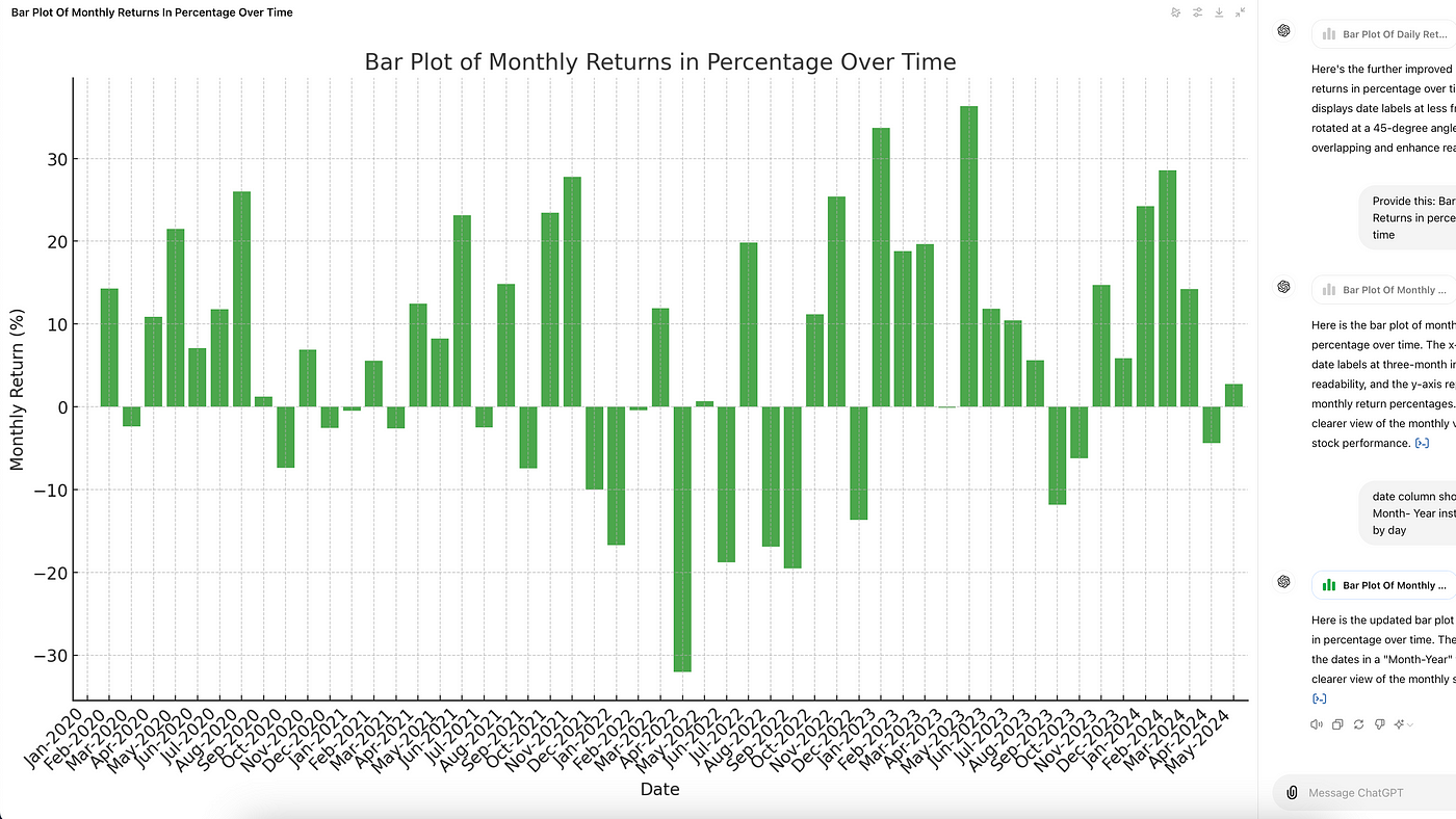
You can also download the chart by clicking on the 3rd button top right.
Line Plot With Trending Events
Wonderful when it comes to analyzing stock prices, everyone wonders how prices have changed over time, right? But since we have a great tool(GPT 4-o), let’s see if the major events affect the price. Here is the prompt;
Plot of the adjusted close price over time with annotations for significant events.
The dataset contains the 'Date' and 'Adj Close' columns.
Identify significant events based on major changes in the stock price and annotate them on the plot.
Here is the plot.
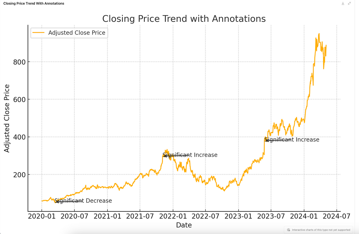
But I wonder if significant increases and decreases correlated with significant events. So I use this;